Your Website Is Silently Costing You Clients Every Day
You spent weeks picking colors. You agonized over photos. You rewrote your about page three times. And yet – new visitors land on your site, scroll for a few seconds, and leave without booking.
Most estheticians don't have a traffic problem. They have a conversion problem.
If your website isn't converting, it's not your design – it's your structure. The order of your sections, the clarity of your offer, and the path from "I just found this" to "I just booked" – that's what determines whether a visitor becomes a client or disappears.
Pretty does not pay rent. Structure does.
Before rebuilding anything, check where you stand today with the free SEO visibility score tool.
What Most Esthetician Websites Get Wrong
Here's what we see over and over:
- Menu overload – 15 services, no hierarchy, no guidance. The visitor freezes.
- No clear CTA – multiple buttons, competing actions, or a booking link buried in the footer.
- Missing trust signals – no credentials, no reviews, no proof above the fold.
- Random page order – about page before services, FAQ before trust, or no logical flow at all.
- No treatment plan positioning – selling $120 facials instead of $1,000+ treatment journeys.
If this sounds like your site, you're not alone. Most spa websites are built around how they look, not how they perform. They're designed to be pretty – not to guide a stranger from curiosity to confidence to booking in under 60 seconds.
Quick self-check: Can a new client book in under 2 clicks from your homepage? Do you show real results above the fold? Do you guide visitors into a treatment plan – not just a single appointment? If not, your site is leaking clients.
Why Structure Matters More Than Design
A plain website with the right structure will outperform a beautiful website with the wrong structure every time.
Visitors don't read your website. They scan it. They make a decision in 3–5 seconds about whether to keep scrolling or leave. If they keep scrolling, they need to hit the right information in the right order to move from curiosity to confidence to booking.
That order is not random. It follows a specific psychological framework that high-converting websites use – whether they know it or not.
Small structural changes can mean 20–40% more bookings from the same traffic. No extra ad spend. No more followers needed. Just a better path from visitor to client.
The 5-Part Framework Behind High-Converting Spa Websites
Every effective spa website follows the same basic flow:
Hook → Trust → Offer → Proof → Close
1. Hook (Hero Section)
This is the first thing visitors see. You have 3 seconds. The hook needs to answer one question: "Is this for me?"
A strong hero includes:
- A clear headline that names who you serve and what outcome you deliver
- One line of supporting context
- A single, visible booking CTA
- A professional image that sets the tone
What kills the hook: generic headlines ("Welcome to My Spa"), multiple competing buttons, slow-loading images, or no clear call to action.
2. Trust
Before a stranger will book with you, they need to believe you are credible. Trust comes immediately after the hook – not buried at the bottom.
Effective trust elements:
- Credentials, certifications, or years of experience
- A trust strip (logos, badges, or a one-line "trusted by X clients" statement)
- Google review count or star rating
- Before-and-after photos (if applicable)
The key insight: trust must come before the offer. If you show services before establishing credibility, visitors have no frame of reference for your value.
3. Offer (Services)
Now the visitor knows who you are and trusts your expertise. This is where you show what you offer – but only the essentials.
Strong service sections:
- 3–5 core services, not 15
- Each with a clear name, one-line description, price range, and booking link
- Organized by tier (entry, signature, premium) or by concern (acne, anti-aging, relaxation)
What kills the offer: too many choices, vague descriptions ("Customized Facial – $80–$200"), no prices, or no booking links.
This is also where treatment plans change the game. Most websites are built to sell a $120 facial. High-performing estheticians structure their site to sell $1,000+ treatment plans. Instead of listing isolated services, they present structured journeys that clients commit to upfront – with better results and predictable revenue. Learn how treatment plans turn one appointment into a $1,500+ client journey.
4. Proof
Proof validates everything above. This is where testimonials, results, and social proof do the heavy lifting.
Types of proof that work:
- Client testimonials (specific outcomes, not just "she's amazing")
- Before-and-after galleries
- Review highlights from Google or Yelp
- Case studies or treatment plan results
Proof answers the question: "Will this work for me?" Place it after the offer so visitors are evaluating specific services – not just your brand in general.
5. Close (Final CTA)
Every high-converting page ends with a clear, confident close. Restate the value, address the last objection, and make the booking button impossible to miss.
Strong closes include:
- A summary of what the visitor gets
- A low-risk offer ("$1 trial," "free consultation," "no cancellation fee")
- One single CTA button – not three options
Visit a live SpaSphere website to see this framework in action.
Why Most Booking Platforms Don't Help Your Website Convert
Here's the uncomfortable truth: your booking platform might be part of the problem.
- GlossGenius gives you a hosted booking page – not a real website. No service pages. No SEO. No Google traffic.
- Vagaro puts you on a marketplace where your listing competes with every other provider in the directory.
- Square Appointments has a basic booking page, but it doesn't rank on Google or build your brand.
These tools are great at scheduling. They're terrible at converting strangers into booked clients. For that, you need a real website on your own domain – with service pages that rank, a booking flow that converts, and a structure designed for esthetician client journeys.
For a deeper comparison, see our booking websites for estheticians guide.
6 Conversion Strategies (Not Templates)
The 5-part framework is the foundation. But the way you arrange and emphasize those parts changes depending on your positioning. Here are six distinct strategies – each built on the same framework but optimized for a different business approach.
1. Growth (Classic Conversion Funnel)
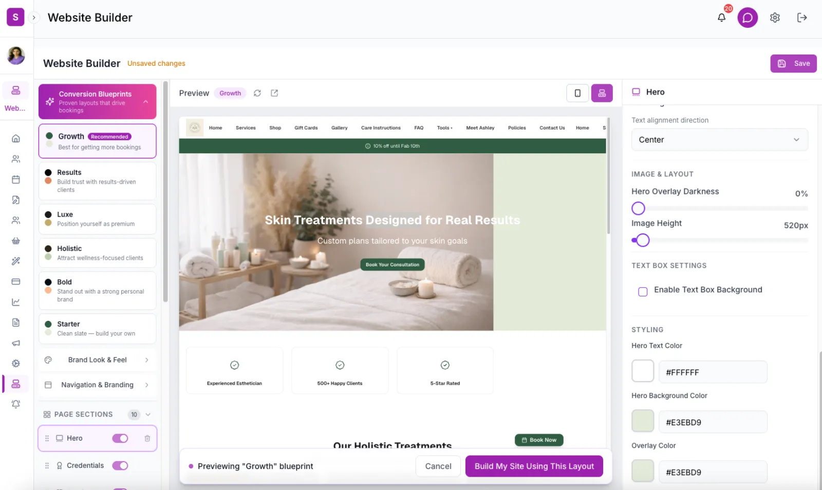
The most balanced, most proven structure. Hook, trust strip, services, treatment plans, proof, FAQ, close.
Best for: most estheticians, especially those growing from solo to small team.
Why it works: it mirrors the natural decision process. The visitor learns who you are, trusts you, sees what you offer, validates with proof, and books. No surprises, no friction.
2. Results (Proof-First)
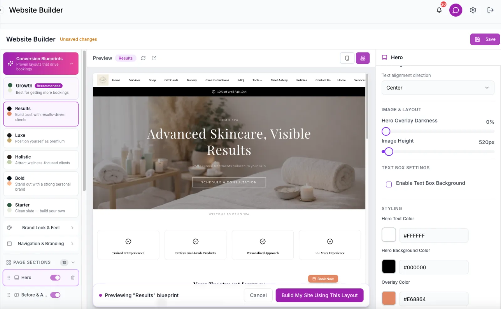
Leads with before-and-after photos and credentials before showing any services. The proof comes first – then the offer.
Best for: estheticians who specialize in corrective work – acne, hyperpigmentation, scarring.
Why it works psychologically: people believe results before they believe marketing. When a visitor sees real skin transformation in the first 5 seconds, everything after that is evaluated through the lens of "this person gets results."
3. Luxe (Experience-First)
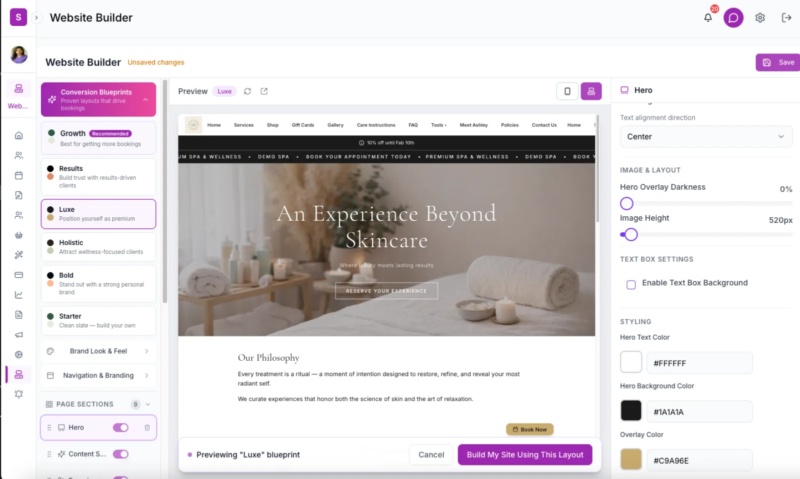
No credentials section. No location block. Story, atmosphere, and editorial media dominate the layout. The experience IS the sell.
Best for: high-end, boutique spas that compete on exclusivity, not price.
Why it works: luxury brands do not explain themselves. They immerse you. A Luxe structure removes the things that make a spa feel accessible (badges, maps, FAQ) and replaces them with things that make it feel aspirational (editorial images, sensory language, curated atmosphere).
4. Holistic (Problem-First Navigation)
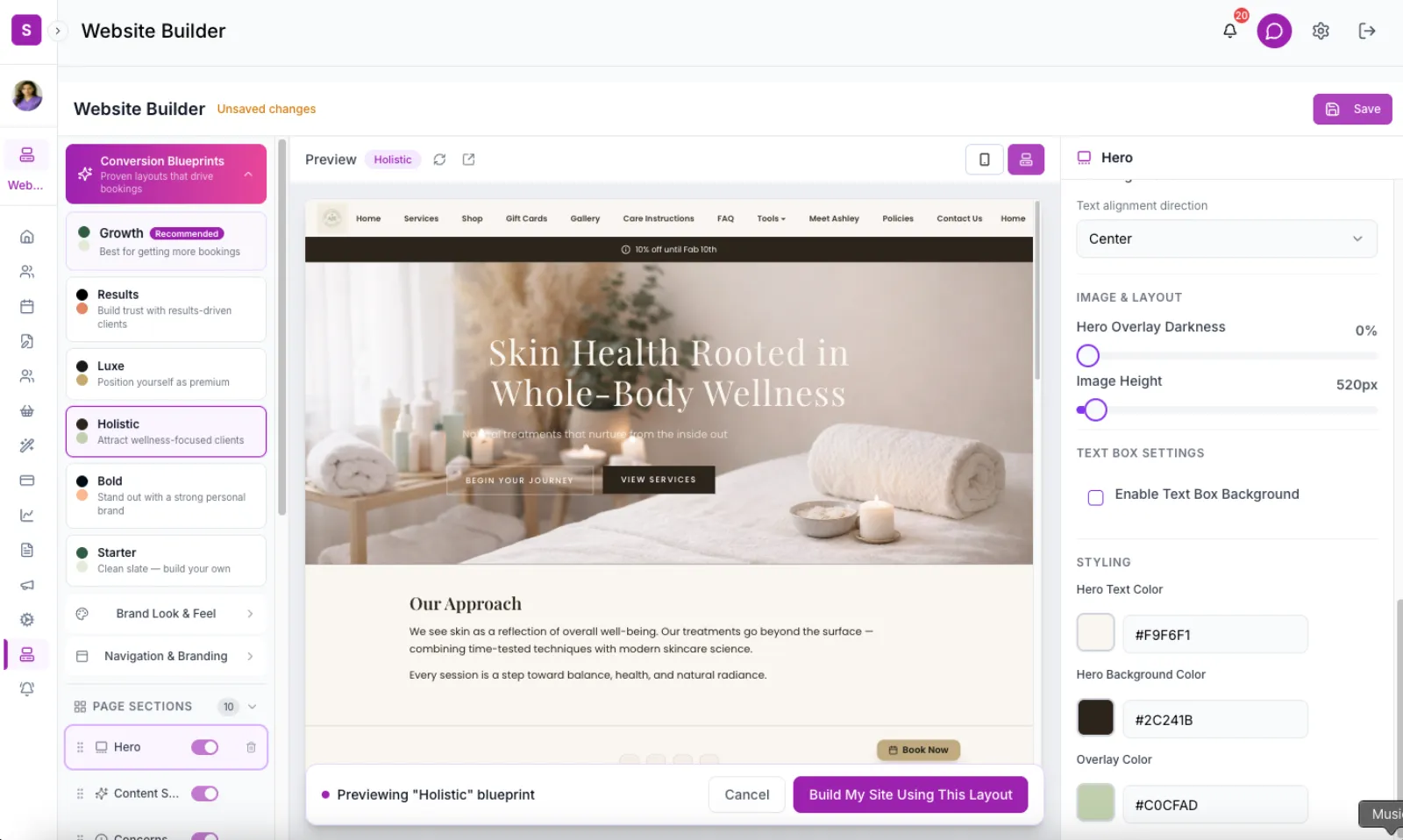
Opens with a "What brings you here?" grid where visitors self-select by skin concern – acne, aging, sensitivity, wellness. Services come after the visitor identifies their need.
Best for: holistic and wellness-focused estheticians serving a wide range of concerns.
Why it works: clients think in problems, not services. They do not search for "enzyme peel." They search for "how to fix dull skin." This structure mirrors that thinking – the visitor finds themselves first, then discovers your solution.
5. Bold (Minimal, Personality-Driven)
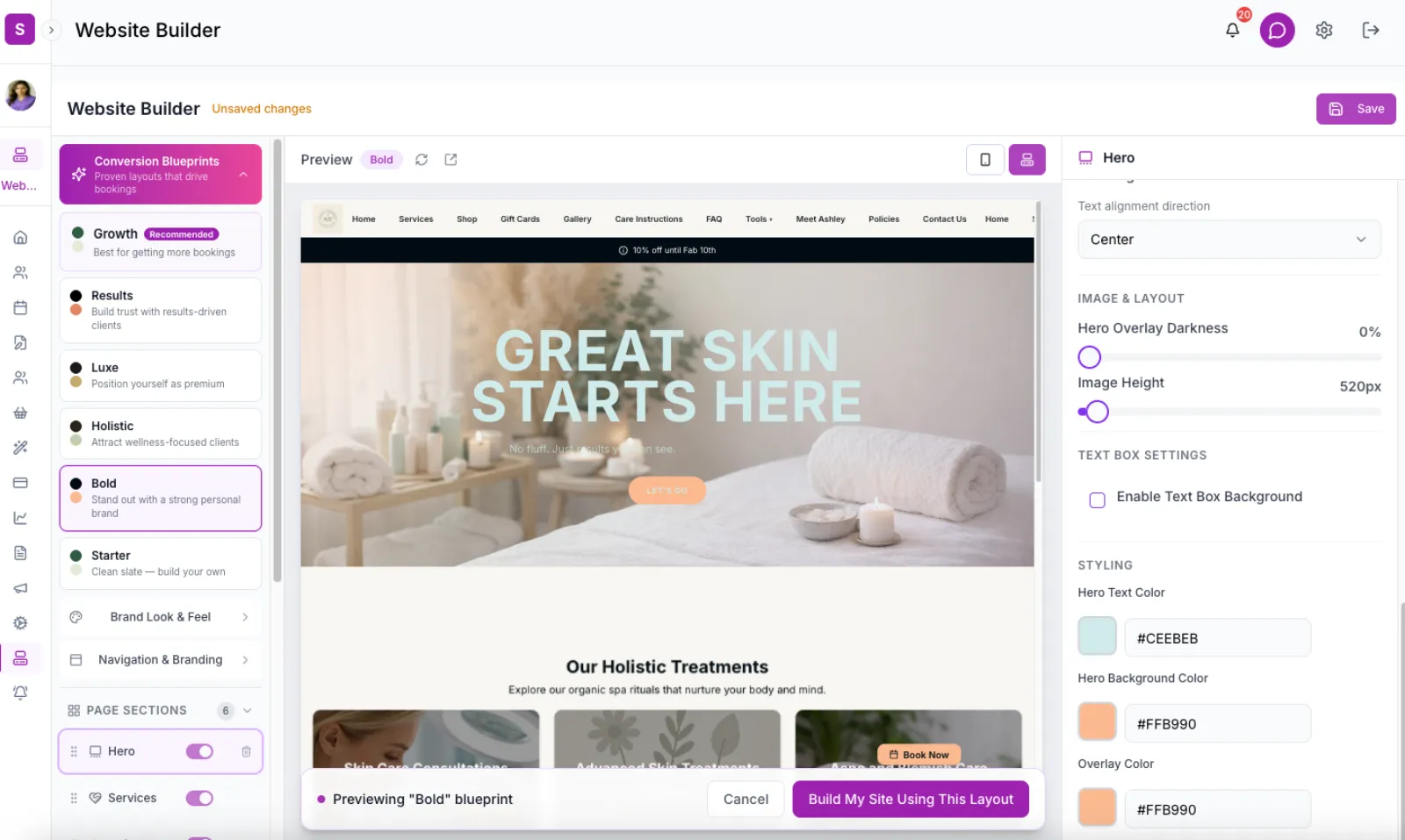
Only 6 sections. No FAQ, no location, no packages. Hero, about, services, reviews, CTA – done. Speed and personality carry the page.
Best for: confident solo estheticians with a strong personal brand.
Why it works: information overload kills conversion. Bold removes everything that is not directly converting. If your personality and reputation already drive bookings, you do not need 12 sections. You need a fast path from "I found you" to "I booked."
6. Starter (Clean Baseline)
Hero, services, CTA. Three sections. Nothing else.
Best for: brand new estheticians who need something live today and will build from there.
Why it works: a simple, functional website is infinitely better than no website or a "coming soon" page. You can always add sections later. But having something that works NOW means you start capturing bookings instead of planning indefinitely.
SpaSphere gives you these 6 conversion blueprints in one click. Pick a strategy, customize your brand, publish.
The Revenue Shift Most Estheticians Miss
Here's where structure becomes a revenue strategy – not just a design decision.
Most websites are built to sell a $120 facial. High-performing estheticians structure their site to sell $1,000+ treatment plans.
When your website guides a visitor into a structured treatment journey instead of a single appointment, three things change:
- Revenue per client jumps. A 6-session acne treatment plan at $1,500+ vs. a $120 one-off facial – from the same visitor.
- Retention becomes automatic. The client is committed to the full journey, not deciding visit-by-visit whether to come back.
- Your brand perception shifts. You're not "another esthetician with a booking link." You're a skin health authority who guides outcomes.
This is exactly why every SpaSphere conversion blueprint includes a treatment plans section in the default structure. Not as an add-on – as a core part of how the site converts visitors into committed clients.
See real examples: acne treatment plan / pigmentation treatment plan / how treatment plans increase retention
Why Pre-Written Copy Matters
One of the biggest conversion killers is not structure – it is blank pages. When a website builder gives you a framework but leaves every text field empty, most estheticians freeze. They do not know what to write for their FAQ. They stare at the "About" section for days.
The solution is opinionated defaults. Pre-written copy that is specific enough to be useful, generic enough to customize, and designed for conversion. Things like:
- FAQ answers that address real booking objections
- CTA text that drives action, not just "Book Now"
- About section starters that focus on the client's outcome, not the esthetician's resume
When copy is already there, the esthetician edits instead of creates. That is the difference between a website that launches in an afternoon and one that sits unfinished for months.
The Workflow That Actually Works
Here is how the best website builders approach this:
- Preview – see the full site with a conversion structure applied, before changing anything
- Compare – switch between strategies to see which one fits your brand
- Apply – one click applies the structure, copy, and visual theme
- Customize – add your photos, tweak the copy, adjust what you need
- Save – publish and start booking
No blank canvas. No guessing what goes where. No hiring a designer to figure out the order of your sections.
Your Website Is Not a Portfolio. It's Your Sales System.
You do not need a better website design. You need a better website structure.
The estheticians who convert the most visitors into booked clients are not the ones with the prettiest sites. They are the ones whose sites follow a logical, proven framework – one that guides every visitor from stranger to client without friction.
If your website isn't guiding clients into a journey, it's just decoration.
SpaSphere's website builder gives you this structure out of the box. Six conversion blueprints, each with a proven section order, pre-written copy, and a paired visual theme – so you get a client-converting website in one click, not one month.
For pricing comparisons, see booking websites for estheticians. To check your current site's performance, try the free SEO visibility score. And to understand how your back bar costs affect profitability, use the back bar calculator.
Get a proven, high-converting website in one click. Six conversion blueprints designed specifically for estheticians. White-glove onboarding included.